A retail giant’s advertising arm needed a website redesign that highlighted their unique value prop.
COLLABORATOR
Walmart Media Group
SKILLS
Participatory Design Workshops, User Journeys, Process Flows, Wireframing, Prototyping
Team
Jess Lewis, Ali Adams, Alejandra Monroy, Neil Caron, Carrie Vogler
―
Walmart Media Group had a truly stellar product suite with a unique value prop, but wasn’t communicating their value. This resulted in them losing out on sales.
So, we created a website that highlighted their unique history, value, and capabilities.
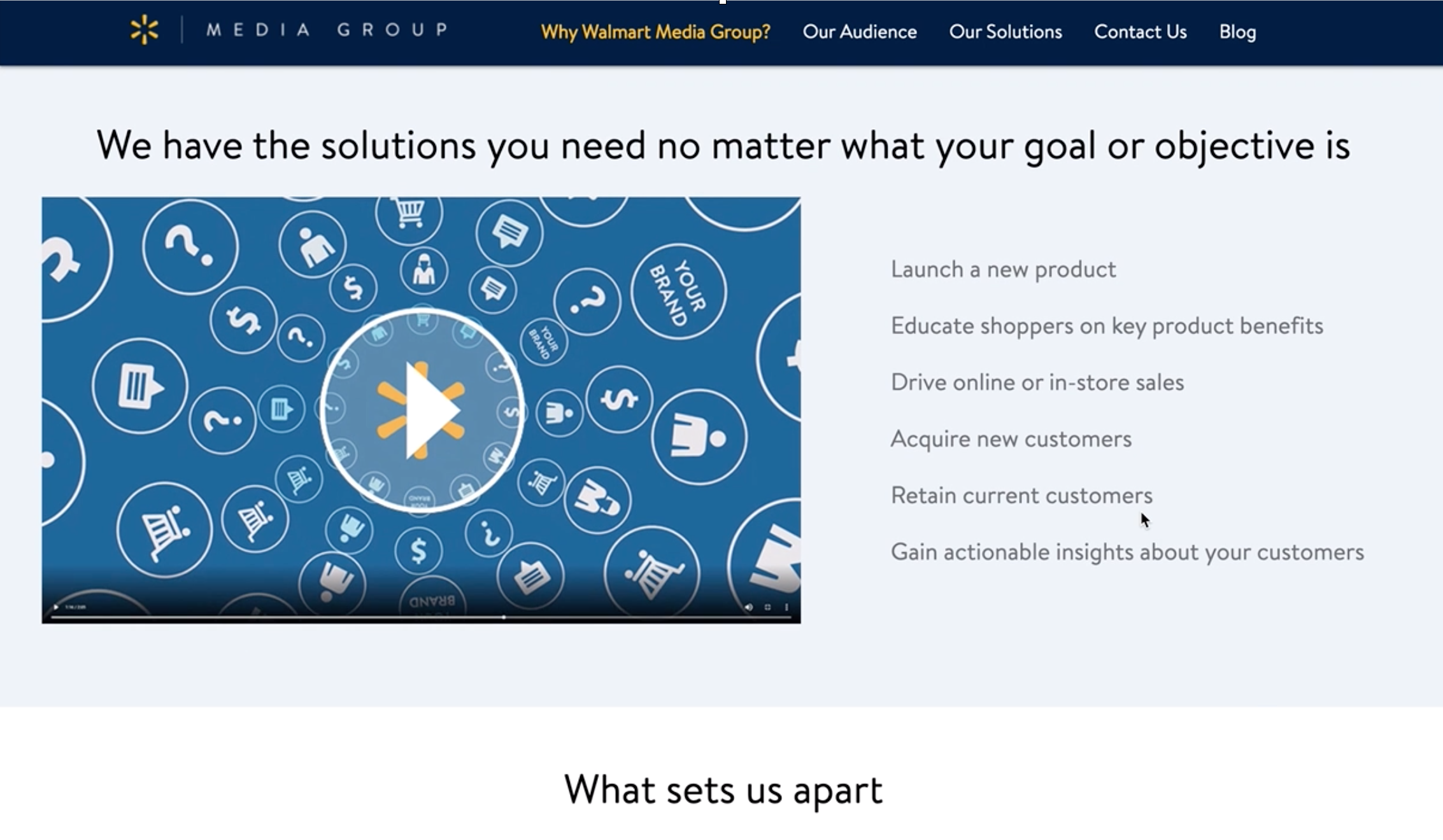
The legacy experience:
Form would expand with the next answer when a radial was selected, making the screen jump and stutter.
Although the user was being pushed down the page by the auto-generated questions popping up, all error messages would appear at the top of the screen. When this would happen, the user would jump up to the top of the screen, losing their place.
What we made together:
How we did it:
1.
Working sessions. Competitive analysis.
A competitive analysis told us about competitors’ offerings and how they’re presented.
We worked closely with our client partners to understand and define their market positioning, their product presentation, and their value props.
2.
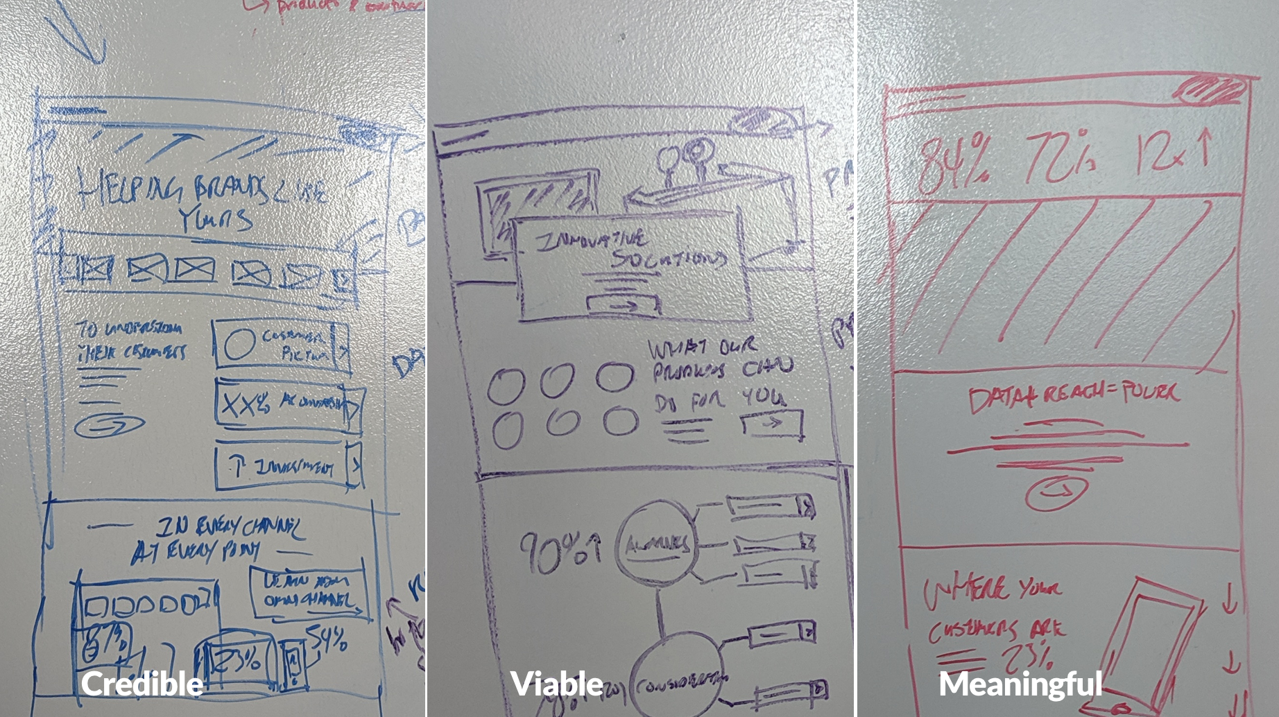
Whiteboarding. Brainstorming.
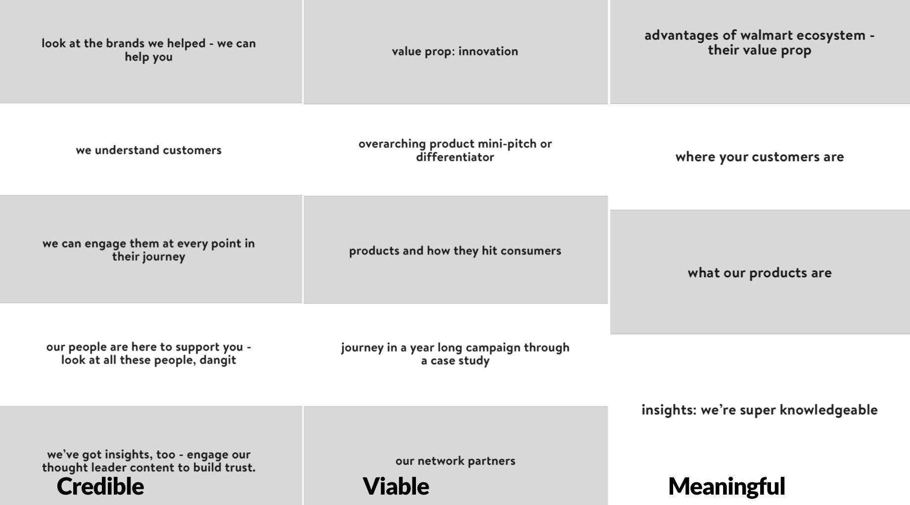
Wielding Expo markers, content and UX got to work to hone in on a set of strategies. We worked alongside one another, sketching out content strategies and UX approaches that would form three defined strategy positionings:
3.
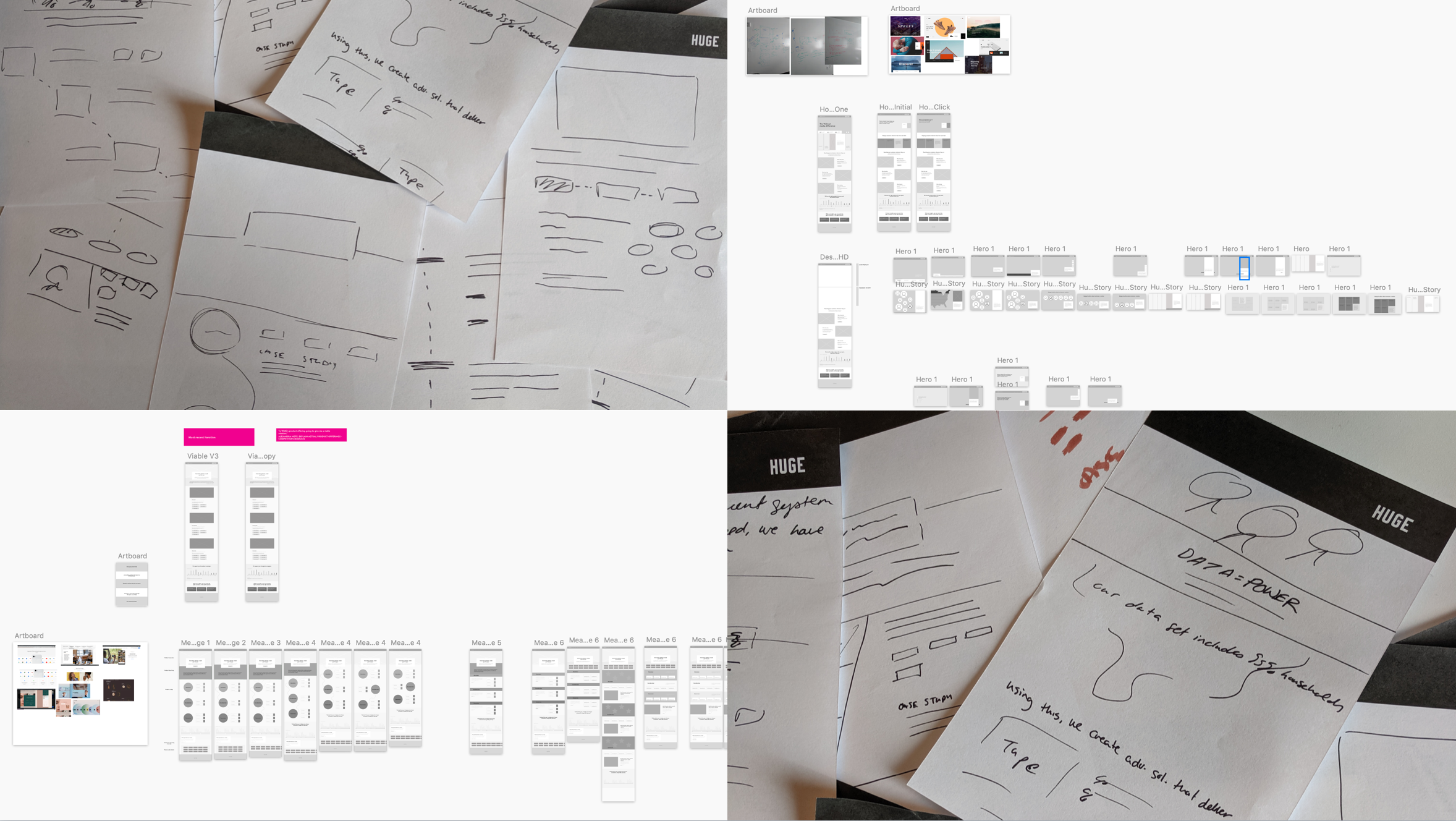
Sketching. Wireframes. Revision.
Cycles of iteration, feedback, strategizing, and brainstorming led us to a concrete set of directions that was presentable to the clients.
Client workshop. Revisions.
We led a workshop with our clients where we worked through the concepts and gathered feedback through workshop activities.
A series of design thinking exercises generated fruitful discussion: dot voting based on three value judgments and sticky-note observations. This generated a discussion that got people out of their seats and marking up the wires.
And, more importantly, it got us aligned on an approach.
4.
Visual Design. Reviews. Revisions.
Working alongside visual designers, we breathed life into strategy and reviewed with clients. After a few revisions, we delivered a magical experience.
We took inspiration from their brand design system and brought their “walmart spark” to life in our design - it is the golden spark that connects users to products across the myriad touchpoints that WMG offers advertisers. As such, it connects across the entire redesign.
5.
It doesn’t matter that you have a truly unique service that people want if they don’t know you’re selling it. Or that it’s unique.
A large part of selling a service is selling confidence in your service - the security that you’ll follow through.


