A retirement services giant needed to digitize their one-time withdrawal process.
COLLABORATOR
AIG Retirement Services
SKILLS
Participatory Design Workshops, User Journeys, Process Flows, Wireframing, Prototyping, Visual Design
Team
Jess Lewis, Philip Spradley, Liz Olson.
―
Because they primarily handle retirement products for teachers and government employees, AIGRS cares deeply for their clients.
Always looking to make things a little easier for these hardworking folks, AIGRS aimed to update all forms - digital, and those that should be digital.
The most impactful form to the business and their clients? One time withdrawals.
The legacy experience:

Form would expand with the next answer when a radial was selected, making the screen jump and stutter.

Although the user was being pushed down the page by the auto-generated questions popping up, all error messages would appear at the top of the screen. When this would happen, the user would jump up to the top of the screen, losing their place.
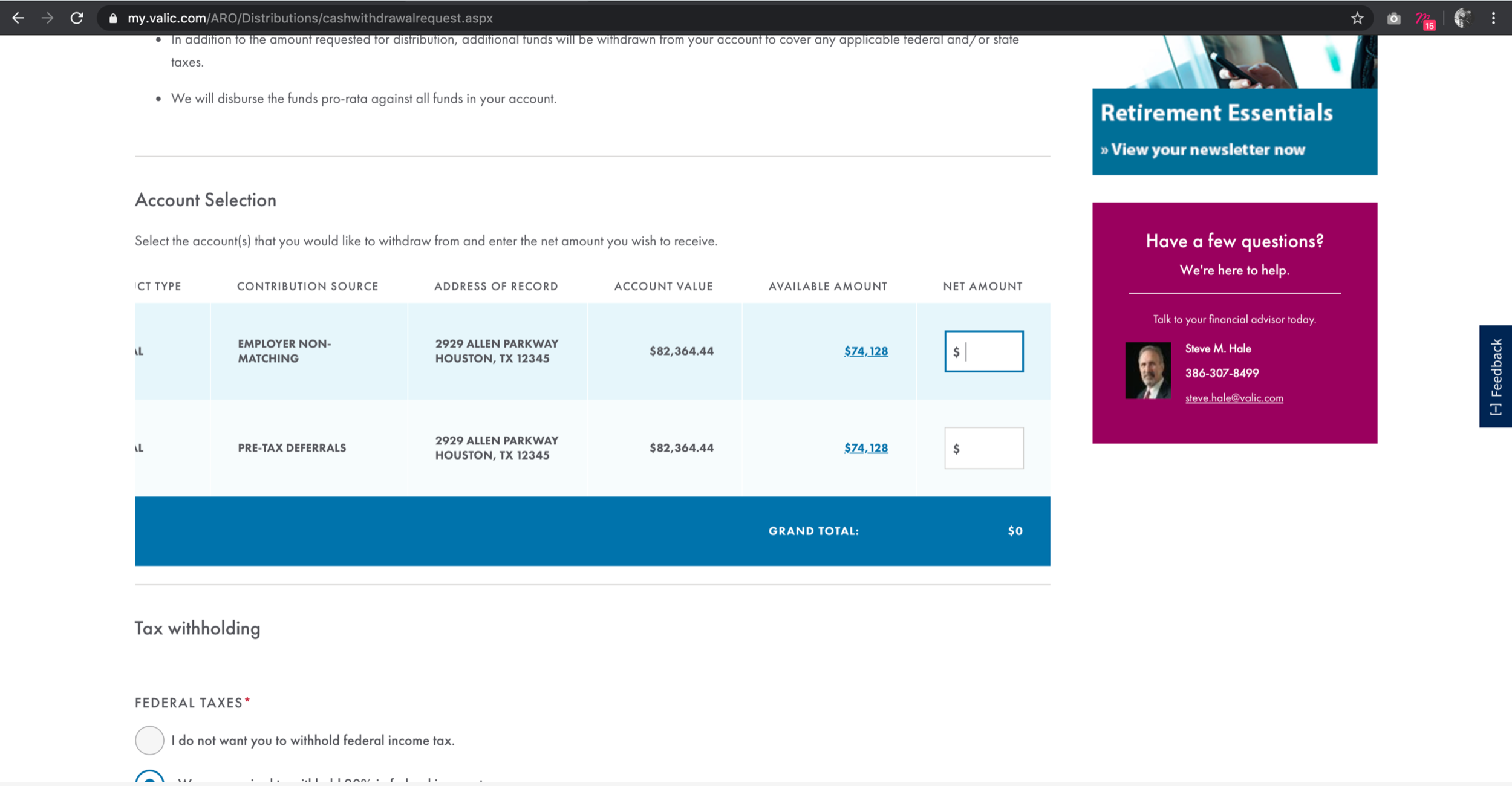
When a user wanted to enter an amount to withdraw, they had to scroll horizontally within the table - a confidence-reducing action for a high-pressure financial decision.
What we made together:

How we did it:
1.
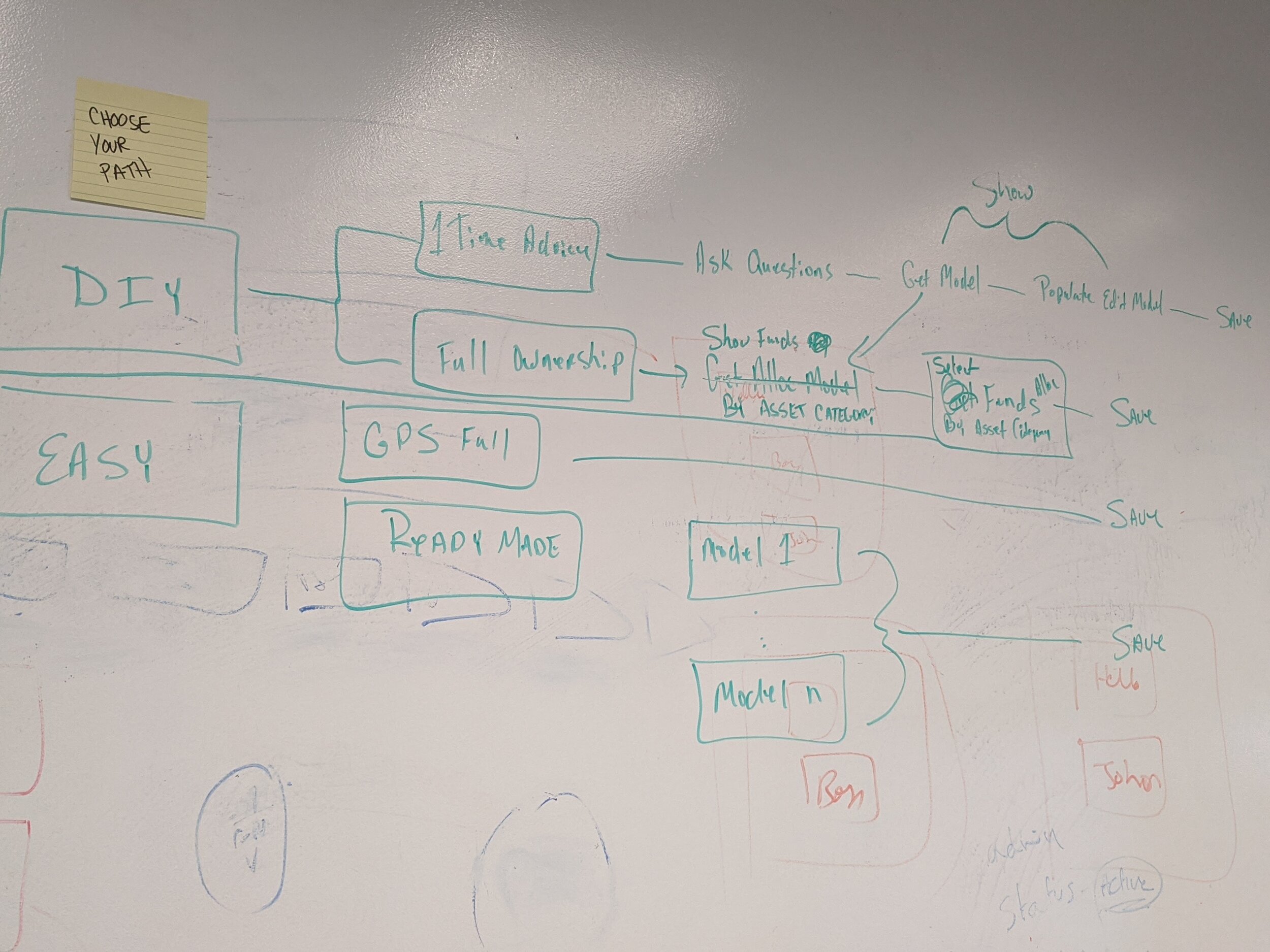
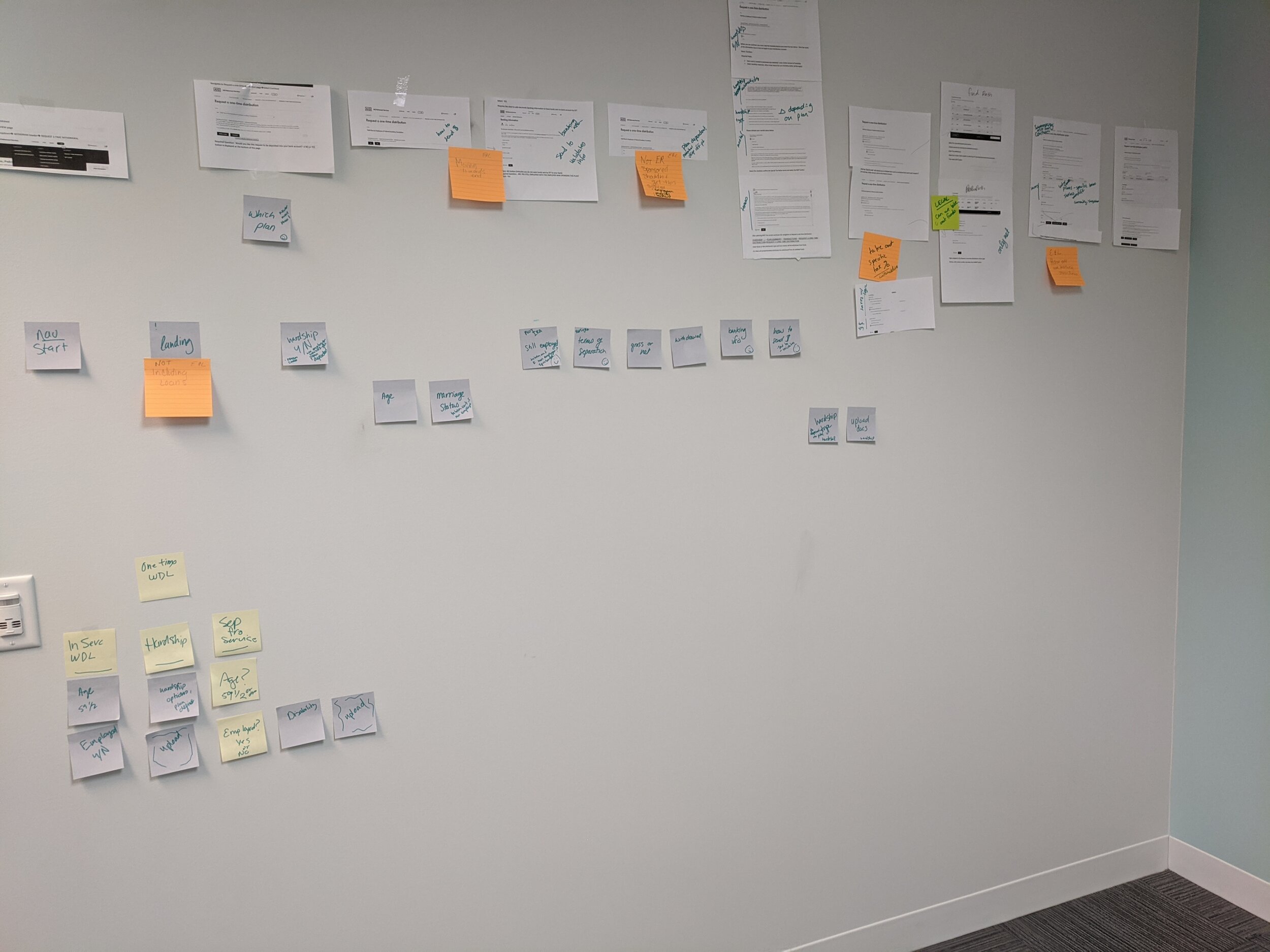
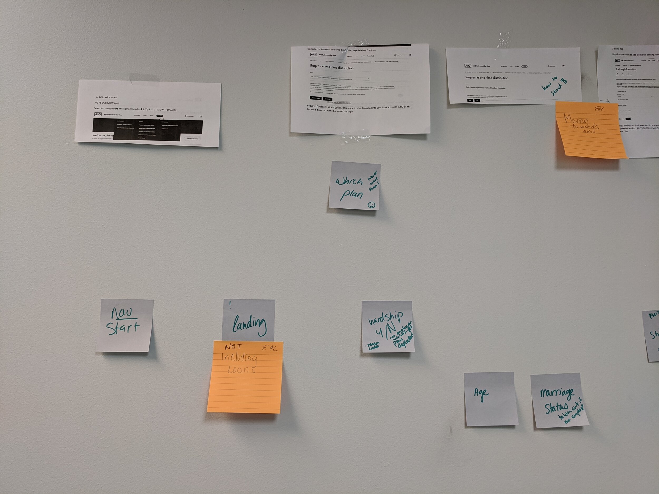
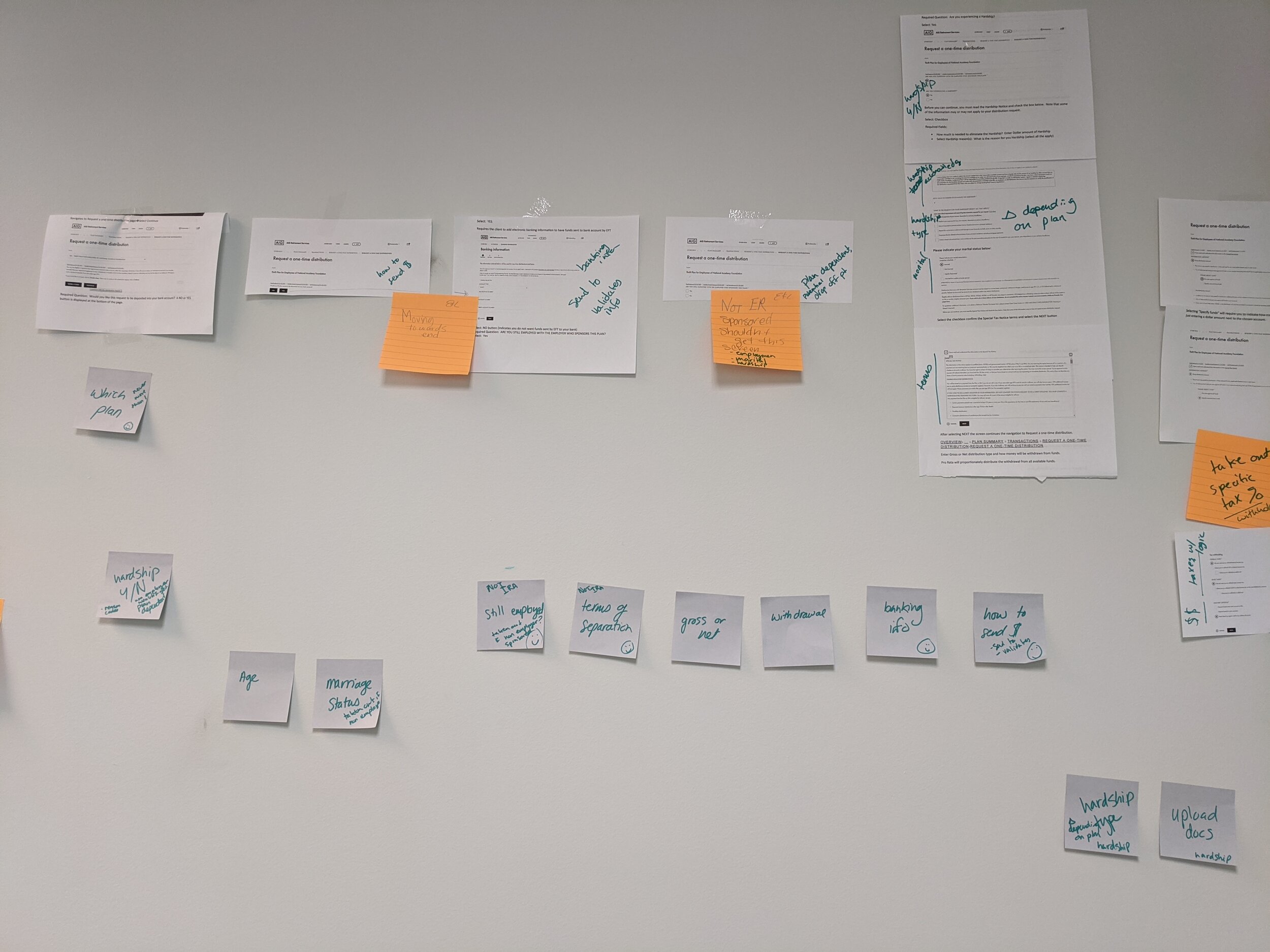
Working sessions. Workshops. Flow diagrams.
Through a series of informal workshops, product, business, and UX gathered a bunch of print outs and post its, hunkered down in a room, and got to work.
Together, we dissected the flow, reorganized it, plotted out all the different necessary paths (5, not including outliers that could not be completed online).
And with UX facilitation and gentle lines of questioning, we found the most elegant path.

2.
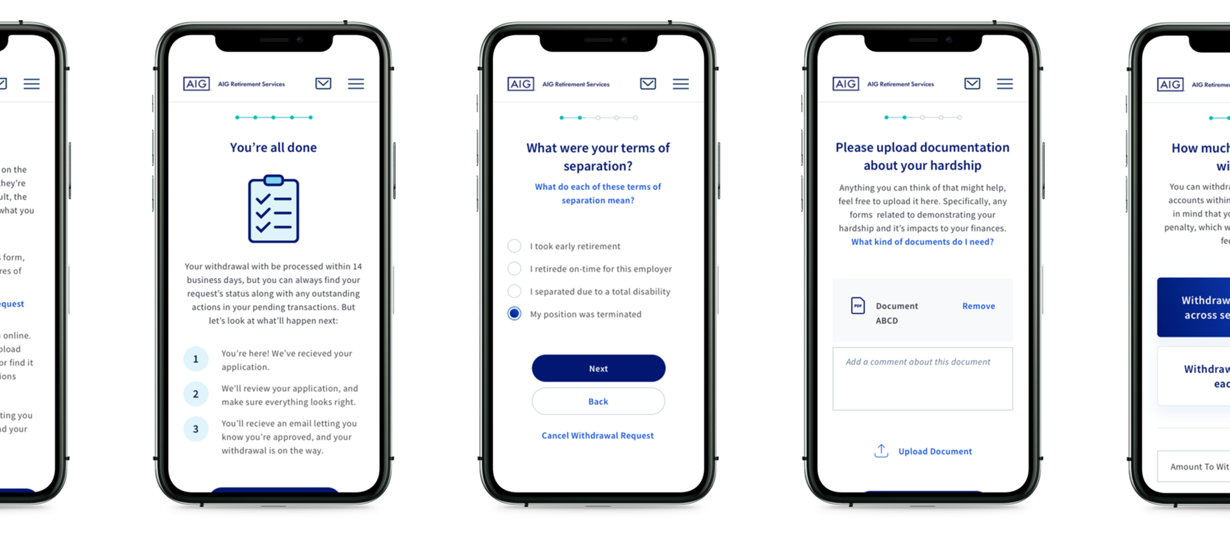
Wireframes. Competitive analysis.
Taking a stepped-out and modular approach, we were able to accommodate high variables of complicated plans within a single flow.


3.
Mockups. Prototype. Revisions.
Then, we applied clean, bright, approachable visuals.
Given that there was no mature design system at all, let alone one for form flows, we decided to use this as an opportunity to create one based on the few stylings that existed.
We introduced simple, effective ux conventions that aimed to reduce cognitive load.
We created a new icon system to add engaging, friendly, colorful visuals to an otherwise anxiety-producing task.

Developer reviews. Revisions.
Working alongside engineering teammates, we ushered these designs from vision to delivery.
4.
Complex problems don’t have to be hard to solve. The right system applied across the board can lead to increased engagement and usability for diverse clients.
A system like this allows a small, flexible team of people to work simultaneously across multiple streams of work, creating change in the lives of the people who help people.